How to Switch On Toggle Functionality and Apply It in Real-World Scenarios

You can switch on toggle functionality with a simple flip or tap, whether you use a physical toggle switch or a digital toggle button in a UI. These toggles give you easy on/off control for devices and settings. A toggle button in a UI changes color or moves when you switch it, so you know its state. Physical buttons offer tactile feedback, making easy on/off control reliable, even in tough conditions. Toggle functionality reduces confusion, keeps button actions clear, and lets you manage settings with confidence.
Key Takeaways
Toggle switches and buttons provide simple on/off control with clear feedback, making device and setting management easy and reliable.
Good toggle button design uses clear labels, bright colors, large touch areas, and consistent styles to improve user experience and accessibility.
Always follow safety steps when wiring toggle switches: turn off power, use quality tools, secure connections, and test thoroughly before use.
Toggle buttons appear in many real-world scenarios, from home appliances and cars to software apps, helping users control features quickly and confidently.
Avoid common mistakes by keeping toggle buttons simple, providing immediate feedback, and ensuring accessibility for all users, including those with disabilities.
Toggle Switch Basics
What Is a Toggle Switch
A toggle switch is a device that lets you control the flow of electricity in a circuit. You use it to make simple on/off choices for lights, machines, or digital settings. When you flip a toggle, you change the state from on to off or the other way around. This action gives you clear feedback, so you always know if something is active or not.
You can find toggle switches in many places. They appear in homes, cars, airplanes, and even on computer screens as digital buttons. Each toggle switch has a lever or button that you move to change its position. Some toggle switches lock in place, while others spring back when you let go.
There are several main types of toggle switches you might use:
SPST (Single Pole Single Throw): Turns one circuit on or off. You often see this type in light switches.
SPDT (Single Pole Double Throw): Switches one input between two outputs. This type helps you select between two power sources.
DPST (Double Pole Single Throw): Controls two circuits at the same time. It is common in industrial equipment.
DPDT (Double Pole Double Throw): Redirects two inputs to one of two pairs of outputs. You might use this for reversing motors.
Momentary Toggle Switch: Returns to its original position when released, like a push-to-talk button.
Locking Toggle Switch: Stays locked in place to prevent accidental switching.
Illuminated Toggle Switch: Lights up when active, making it easy to see in the dark.
How Toggle Switches Work
Toggle switches work by moving a lever or button to open or close an electrical circuit. When you flip the switch, metal contacts inside connect or disconnect, allowing electricity to flow or stop. This simple action makes toggle switches reliable and easy to use.
The history of the toggle switch shows how important it is. Early switches were large and unsafe. In 1917, William J. Newton invented the toggle switch with a hinged lever and hidden metal parts. This design made switches safer and easier to use. Over time, toggle switches became the standard for controlling lights and machines in homes and businesses.
Today, you see toggle switches in many advanced systems. Engineers use them in airplanes and military equipment because they can handle shock, vibration, and extreme temperatures. New designs include sealed switches for harsh environments and miniature versions for tight spaces. Digital toggle switches now appear in software, giving you the same control with a tap or click.
Tip: When you choose a toggle switch, think about where you will use it. Some switches work better in tough conditions, while others are best for simple tasks at home.
Switch On Toggle in UI and Hardware
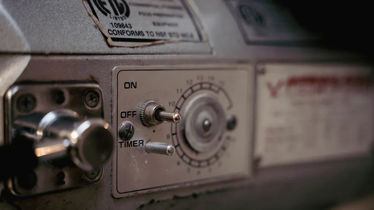
Toggle Button Design
You can create fully interactive toggle buttons in a UI by following a few simple steps. Start with a clear toggle button design that helps users understand what the button does. Good toggle design uses clear labels, contrasting colors, and consistent shapes. When you switch on toggle functionality, you want users to see an immediate change. This helps them know if a setting is on or off.
Use simple and intuitive toggle buttons. Avoid confusing icons or unclear labels.
Make sure each button is large enough for easy tapping. A size of at least 44x44 pixels works well for touch screens.
Use bright colors for active states and subdued colors for inactive states. This color difference makes the toggle button state obvious.
Group related toggle buttons together. This helps users find and use them quickly.
Keep toggle button design consistent across your UI. Consistency improves user experience and reduces mistakes.
You can build a toggle button using HTML, CSS, and JavaScript. Start with a checkbox input in your HTML. Style the label to look like a switch. Use CSS for rounded edges, color changes, and smooth animations. JavaScript can handle the logic for switching states and updating the UI. Many developers use frameworks like Bootstrap to add toggle buttons quickly. These frameworks offer ready-made styles and responsive layouts.
Tip: Test your fully interactive toggle buttons on different devices and browsers. Make sure the button works well everywhere.
Usability studies show that users prefer toggle buttons that are easy to recognize and operate. Slider toggles are now common, but you should avoid using red to mean "on" because users expect green or blue for active states. Always focus on clear toggle design to improve user experience.
Wiring Toggle Switches
When you install toggle switches in hardware, safety comes first. You must always turn off the power before you start. Gather your tools: a toggle switch, wires, wire strippers, screwdrivers, electrical tape, and safety goggles. Use only quality switches that meet standards like UL or CE. These switches work better and last longer.
Follow these steps to wire a toggle switch in an electrical circuit:
Identify the switch terminals. For two-terminal switches, connect one wire to each terminal. For three-terminal switches, connect the common terminal to power and the others to the load.
Secure the wires using screwdrivers or crimping tools. Use wire nuts or terminal connectors for a tight fit.
Insulate any exposed metal with electrical tape.
Mount the switch securely in place.
Restore power and test the toggle switch to make sure it controls the device as expected.
Wear safety glasses and insulated gloves during installation. Use insulated tools to prevent shocks. Mark your wires with tape for easy troubleshooting later. Always check your work with a multimeter before turning the power back on. Choose toggle switches with the right IP rating if you need protection from dust or water. For tough jobs, use industrial-grade toggle switches that resist shock and vibration.
Note: Regulatory standards from groups like IEC, ANSI, and ISO help ensure your toggle switches are safe and reliable. Always follow manufacturer instructions and local codes.
Accessibility Tips
You can make fully interactive toggle buttons accessible to everyone by following a few key guidelines. Accessibility features help users with disabilities use your UI with ease. Start by making each button large enough—at least 24 pixels, but 44 pixels is better. Use high color contrast between the button and its background. This helps users with low vision or color blindness.
Use ARIA attributes like
aria-pressedandaria-labelto tell screen readers about the button’s state and purpose.Make sure users can switch on toggle functionality with a keyboard. The spacebar or Enter key should activate the button.
Provide clear and concise labels. Avoid using only icons unless you add a text label or ARIA label.
Differentiate toggle buttons from links. This helps users know what each button does.
Add visible focus indicators so users can see which button is active when using a keyboard.
Hide decorative icons from assistive technologies using
aria-hidden.Give help text near disabled buttons to explain why they are inactive.
You improve user experience by making toggle buttons easy to use for everyone. Accessibility features like keyboard navigation, screen reader support, and clear visual cues make your UI more inclusive. Always test your fully interactive toggle buttons with different assistive technologies to ensure they work as expected.
Remember: Good toggle design includes accessibility from the start. This ensures everyone can switch on toggle functionality and enjoy a smooth user experience.
Toggle Switch Applications

Digital Use Cases
You see toggle buttons in almost every modern software application. These buttons help you control features with a single tap or click. You can use a toggle button to turn notifications on or off, enable dark mode, or manage your in-app preferences. Many apps use toggle buttons for quick changes that do not need extra confirmation.
You can activate or deactivate features like real-time updates or reports.
Toggle buttons let you set dashboard layouts and workflow processes.
You control security settings, such as encryption or user access, with a simple button.
Mobile apps use toggle buttons for Wi-Fi, Bluetooth, and location services.
Web applications use toggle buttons for newsletter subscriptions, cookie acceptance, and theme switching.
Toggle buttons give you instant feedback. You know right away if a setting is active or not. This makes them perfect for simple on/off choices that affect the whole application.
Hardware Examples
You find toggle switches in many home appliances and vehicles. These switches give you reliable control over devices. In your home, you use a toggle button to turn lights or fans on and off. Home automation systems use toggle buttons for smart lighting and small appliances. You get clear tactile feedback, so you always know the state of the button.
In cars, toggle buttons control headlights, fog lamps, and even ignition systems. Automotive toggle buttons are durable and often have illumination or waterproofing. When you install a toggle button, you must match the type and rating to the device. Secure wiring and stable mounting keep the button safe and reliable.
Smart home technology uses toggle buttons in new ways. You can create custom lighting scenes, schedule lights, or control devices with your voice. Some toggle buttons have built-in safety features like overload protection. Others send alerts to your phone if something unusual happens. You can even personalize the look of your toggle buttons to match your home’s style.
Everyday Scenarios
Toggle buttons make daily life easier and safer. In factories, industrial toggle buttons give you both tactile and sound feedback. You always know if a machine is on or off. Some toggle buttons have locking mechanisms or guards to prevent accidents. Emergency stop buttons, which work like toggle buttons, let you shut down equipment fast.
At home, smart toggle buttons let you control lights with your voice or phone. You can set up routines for different times of day. Scheduling lights helps you save energy and makes your home look occupied when you are away. Toggle buttons can also work with other smart devices, like door locks or cameras, to improve safety.
Tip: Choose toggle buttons with clear labels and good color contrast. This helps everyone, including people with disabilities, use the button with confidence.
Toggle Button Best Practices
Common Mistakes
When you design or install toggle buttons, you can run into several common mistakes. Many developers use toggle buttons for actions that need confirmation, but toggle buttons work best for instant changes. You should only use a button when you have a clear on/off decision. Sometimes, people use toggle buttons for multiple selections, which can confuse users. Checkboxes work better for that purpose.
You might see toggle buttons used in complex settings with many dependencies. This can make toggle button interaction hard to understand. Always keep the button simple. Another mistake is mixing up toggle switches and toggle buttons. Each serves a different purpose, so you should not use them interchangeably.
In digital interfaces, you may forget to give clear feedback when a button changes state. Users need to see or hear that the button worked. Low contrast colors or missing labels can make it hard to tell if a button is on or off. Some toggle buttons are too small, making them hard to tap, especially on mobile devices. Inconsistent button behavior across platforms can also hurt user experience.
When wiring hardware toggle buttons, loose screws or poor soldering can cause the button to fail. Exposed wires or damaged covers can lead to safety hazards. Dirt or rust inside the button can make it stick or stop working.
Tip: Always check if a toggle button is the right choice for your setting. If the action is complex or needs confirmation, use a different control.
How to Avoid Errors
You can avoid most errors by following a few best practices for toggle buttons. First, always provide immediate feedback when a button is switched. Use clear, action-oriented labels like "On" and "Off" to help everyone understand the button state. Make sure your button has a large touch area—at least 44x44 pixels—so users can tap it easily.
Design your toggle buttons with high contrast colors. This helps users see the difference between on and off states. Stick to simple designs and avoid overcomplicating the button. If your button controls something important, show a loading or error state so users know what is happening.
For hardware toggle buttons, turn off the power before you start any wiring. Use insulated tools and wear safety gear. Secure all wires tightly to the button terminals. Keep the area clean and dry to prevent accidents. If you see any damage or loose parts, fix them before using the button.
You should test toggle buttons often. Use a multimeter to check wiring and make sure the button works. Replace any button that shows signs of wear or damage. Always follow local safety codes and ask a professional if you are unsure.
Remember: Good toggle button design improves user experience for everyone. Clear labels, strong feedback, and safe installation make every button reliable and easy to use.
You can implement toggle buttons by following clear steps: gather your tools, turn off power, connect wires, and test your button for hardware, or use HTML, CSS, and JavaScript for digital toggle buttons. These switches improve efficiency and user satisfaction in many settings, from smart homes to industrial machines. Try using toggle buttons in your next project to make controls simple and reliable.
For more ideas, explore creative toggle button designs and check out guidelines from trusted design groups.
FAQ
What is the difference between a toggle switch and a push button?
A toggle switch stays in its new position after you flip it. A push button returns to its original position after you press and release it. You use toggle switches for on/off control. Push buttons work best for momentary actions.
How do you know if a toggle button is on or off?
You can check the color, label, or position of the toggle button. Most toggle buttons use green or blue for "on" and gray for "off." The button may also move or show a checkmark when active.
Tip: Always look for clear labels or color changes to avoid confusion.
Can you use toggle switches outdoors?
Yes, you can use toggle switches outdoors if you choose weatherproof models. Look for switches with a high IP rating. These switches resist water and dust. Always follow safety instructions when installing them outside.
Why should you test toggle switches after installation?
Testing helps you make sure the switch works as expected. You can catch wiring mistakes or faulty parts early. This step keeps your devices safe and reliable.
Use a multimeter for electrical switches.
Try the button several times to check for smooth operation.
Are toggle buttons accessible for everyone?
Toggle buttons can be accessible if you design them well. Use large sizes, high contrast, and clear labels. Add keyboard support and screen reader features. Test your buttons with different users to make sure everyone can use them.