The Surprising Power of Different UI Chip Types
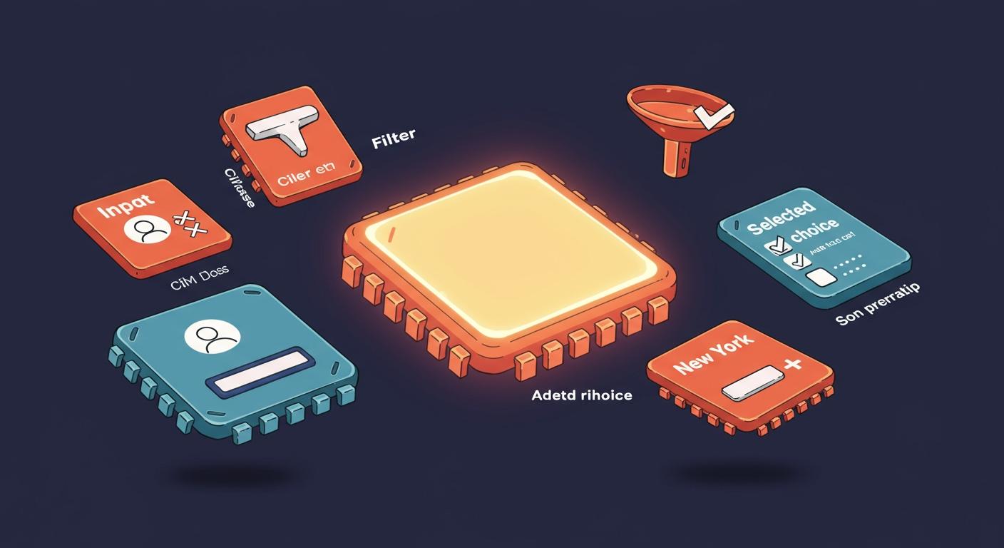
You can think of UI chips as small, interactive labels in a user interface. These compact ui elements represent an input, attribute, or action. You use them to improve the ui and overall ux. Good ui design uses these to help users enter information or make selections. Understanding different chip types lets you build a better ui and ux, creating a more intuitive ui for everyone. A great ui makes tasks simple. This powerful ui tool streamlines your ui.
Key Takeaways
- UI chips are small, interactive labels. They help users enter information or make choices easily.
- There are different types of chips, like Input, Filter, Suggestion, and Assist chips. Each type has a special job in a user interface.
- Input chips hold complex information. Filter chips help you sort content. Suggestion chips offer quick answers. Assist chips give smart shortcuts.
- Good chip design means clear actions, short labels, and handling many chips well. This makes the user interface easy to use.
- Make chips accessible for everyone. Use special codes for screen readers and allow keyboard navigation. This helps all users.
Exploring Different Chip Types
You can build a better user experience when you understand the different chip types available. Each type serves a unique purpose in your ui. Choosing the right one makes your application more intuitive and efficient. Let's explore the main chip variants you can use.
Input Chips
Input chips represent pieces of complex information in a compact form. Think of them as smart tags inside an input field. You often see them in email clients for recipients or in project management tools for tags. Unlike a standard text field for free-form writing, an input chip represents a single, contained piece of data. This makes your ui cleaner when handling multiple entries.
A great use case is adding people to a project task. You can use a "people chip" to assign a task owner. This chip can link directly to the person's contact details. You could also add a "file chip" to attach project documents. This organizes information clearly for your team.
💡 Tip: Input chips provide dynamic visual feedback. You can design them to show an error state for invalid data, improving the overall ui.
<!-- The main container for the chip -->
<div id="user-chip" class="chip">
  <span>Alice</span>
  <!-- The 'x' button to remove the chip -->
  <button class="chip-close-btn" onclick="removeChip()">×</button>
</div>

<style>
  /* Basic styling for the chip container */
  .chip {
    display: inline-flex;
    align-items: center;
    padding: 4px 8px;
    background-color: #e0e0e0;
    border-radius: 16px;
    font-size: 14px;
  }
  /* Styling for the close button */
  .chip-close-btn {
    margin-left: 8px;
    border: none;
    background: none;
    cursor: pointer;
    font-size: 16px;
  }
</style>

<script>
  // JavaScript function to hide the chip when the button is clicked
  function removeChip() {
    const chipElement = document.getElementById('user-chip');
    chipElement.style.display = 'none';
  }
</script>
Filter Chips
Filter chips help you sift through content. They appear as a set of tappable buttons that represent filtering options. When you select a filter chip, the ui instantly updates the relevant content to match your choice. You can design them for single-select (like choosing one category) or multi-select (like choosing several product attributes).
Imagine you are building an e-commerce site. You can use filter chips to let users narrow down products by:
- Brand: "Apple," "Samsung," "Google"
- Color: "Black," "White," "Blue"
- Size: "Small," "Medium," "Large"
This provides a highly visual and immediate way for users to control the information they see, creating a responsive and helpful ui.
// Sample data for our filter chips
let chipsData = [
    { id: 1, text: 'Laptops' },
    { id: 2, text: 'Monitors' },
    { id: 3, text: 'Keyboards' },
    { id: 4, text: 'Mice' }
];

// Initialize the ChipList component
let chip = new ChipList({
    // The data source for the chips
    chips: chipsData,
    // Allow multiple chips to be selected
    selection: 'Multiple',
    // Pre-select 'Monitors' and 'Mice' by their IDs
    selectedChips: [2, 4],
});

// Add the chip list to a container element in your HTML
chip.appendTo('#chip-filter-container');
Suggestion Chips
Suggestion chips guide you toward a desired action or input. They appear dynamically to suggest potential next steps or responses. You commonly find them in chatbot interfaces, where they are also known as "Quick Replies." These chips make it easier for you to interact with a system because you can simply tap a suggestion instead of typing a response. This ensures the bot receives a defined query, which leads to more accurate answers and a smoother ui.
For example, after you ask a chatbot about store hours, it might present suggestion chips like:
- "Find a location"
- "Contact support"
- "See weekly deals"
Each chip triggers a predefined path in the conversation, making the interaction fast and efficient. This is a powerful way to improve the ui of any conversational interface.
Assist Chips
Assist chips help you perform a smart, contextual action. These chips are proactive. They present a relevant shortcut based on your current task or content. They are not for filtering or entering data but for triggering a helpful function. A well-designed ui uses assist chips to make complex actions simple.
A perfect example is found in Google applications. When you type an address into a Google Sheet, it can be converted into a "place chip." This chip shows a map preview. Clicking it gives you directions in Google Maps without ever leaving the sheet. This saves you time and streamlines your workflow. These chip types make any ui feel smarter.
You can create an assist chip that triggers a function using a framework like Material UI (MUI) for React. The onClick prop is key here.
import React from 'react';
import { Chip } from '@mui/material';

function CalendarAssistChip() {
  // This function will run when the chip is clicked
  const handleCreateEvent = () => {
    alert('Opening calendar to create a new event...');
    // In a real app, this would open a calendar modal or page.
  };

  return (
    <Chip
      label="Create Calendar Event"
      onClick={handleCreateEvent}
    />
  );
}

export default CalendarAssistChip;
This code creates a clickable chip. When you click it, the handleCreateEvent function runs, launching a primary action for the user.
UI Chip Best Practices

Following best practices helps you create a better ui and a more positive ux. When you design chips correctly, you make your interface more intuitive and efficient for everyone.
Ensure Clear Interactivity
You must show users that your chips are interactive. A common design mistake is making chips that look like static text. This creates uncertainty and a poor ux. You can avoid this by providing clear visual feedback. Your ui should change the mouse cursor to a pointer when a user hovers over a chip. The chip itself should also change its appearance. A good ui shows different states:
- Hover: A subtle change when the mouse is over the chip.
- Focus: A visible outline when a user navigates with a keyboard.
- Active: A distinct style when the chip is clicked or selected.
These states tell users that the element is clickable, improving the overall ui.
Keep Labels Scannable
Your chip labels should be short and easy to read. Aim for one or two words that clearly describe the content. If you must use longer text, you should truncate it with an ellipsis (...). Always leave enough characters for the user to understand the context. You can show the full text in a tooltip on hover. However, remember that tooltips are not a replacement for a clear ui.
Manage Overflow Gracefully
Sometimes you will have more chips than can fit on the screen. Your ui needs to handle this situation gracefully. The best solution is to place the chips in a horizontally scrollable container. This keeps your ui clean and prevents wrapping issues. You can achieve this with simple CSS properties like overflow-x: auto and white-space: nowrap on the container. This lets users swipe or scroll through all available options without cluttering the ui.
Building a Reusable Chip Component
Creating a reusable chip component saves you time and ensures consistency across your ui. A flexible chip component should accept different properties, or "props," to control its appearance and behavior. This approach enhances your ux. Key props to include are:
| Prop | Description |
|---|---|
label | The text displayed on the chip. |
onDelete | A function to run when a delete icon is clicked. |
onClick | A function to run when the chip is clicked. |
disabled | A boolean to disable user interaction. |
color | Defines the visual style of the chip. |
By using these props, you can easily configure your component for any use case.
Accessible Chips UI Design
You can create a great user experience (ux) for everyone by making your chips accessible. An accessible chips ui design ensures that people using assistive technologies can interact with your ui effectively. This improves the overall ux of your application.
Using Correct ARIA Roles
You should use ARIA (Accessible Rich Internet Applications) roles to give screen readers context about your ui. These roles explain what an element is and how it works. For a list of chips, you can use role="listbox" on the container. Each chip inside gets a role="option". This tells the user they are in a list of selectable items. A good ui provides this essential information.
Here are some key ARIA attributes you can use to improve your ui and ux:
| Attribute | Purpose |
|---|---|
role=listbox | Identifies the chip container as a list of options. |
role=option | Identifies each chip as a selectable item in the list. |
aria-selected | Tells the user if a chip is selected (true) or not (false). |
aria-disabled | Shows that a chip is visible but not interactive. |
Using these attributes correctly makes your ui much easier to navigate for screen reader users.
Managing Keyboard Focus
Your ui must support keyboard-only navigation. Users should be able to move into and out of a chip group using the Tab key. Once a chip group has focus, you should let users navigate between individual chips using the ArrowLeft and ArrowRight keys. This creates a predictable and efficient ux.
You also need to provide a clear visual indicator for the focused element.
- Never remove the default browser outline with
outline: noneunless you replace it. - Your focus indicator must have a color contrast ratio of at least 3:1 against adjacent colors.
- Using the
:focus-visiblepseudo-class in CSS is a great way to show the focus outline only for keyboard users, which improves the ui for everyone.
A visible focus state is a core part of an accessible ui.
Providing Screen Reader Text
Screen readers need clear text to announce what an element does. If your chip has a remove button that is just an 'x' icon, you must provide a text alternative. You can use the aria-label attribute to give the button a name.
For example, you can add
aria-label="Remove Banana"to the close button on a "Banana" chip. This makes the ui much clearer.
When a user deletes a chip, the ui should announce the action. You can do this by linking the chip's text to its remove button. This provides helpful feedback and a better ux. A thoughtful ui communicates every action clearly.
You now see that UI chips are powerful tools for your ui. Your ui can manage selections, actions, and filters with them. Understanding the different chip types helps you build a better ui. Your ui will be more efficient and improve the user ux. A great ui creates a great ux. Your ui design improves with this knowledge. A better ui means a better ux. This makes your ui stronger.
🚀 Your challenge is to leverage the correct chip types for each task. This choice will greatly enhance your ui and overall ux.
FAQ
When should I use a chip instead of a button?
You use chips to represent selections, filters, or inputs. A button triggers a primary action, like submitting a form. Chips manage choices within the ui. A button completes a task. This distinction improves your ui. A clear ui guides users effectively. Your ui benefits from this clarity.
Can a single chip have multiple functions?
Yes, a chip can be both clickable and dismissible. For example, an input chip might open a profile on click and have an 'x' to be removed.
Be careful not to overload the chip. A simple ui is often the best ui. A complex ui can confuse users.
How many chips are too many for a good ui?
There is no magic number. Your ui should not feel cluttered. You should use a horizontally scrollable container if you have many chips. This design keeps your ui clean. A tidy ui provides a better experience. The goal is a functional ui.
What is the main difference between Assist and Suggestion chips?
Assist chips offer proactive actions based on context, like creating an event from a date. Suggestion chips guide your next input, like offering replies in a chat. One helps you do something smart in the ui. The other helps you say something in the ui. This makes the ui feel responsive.